
Stony Brook University Hospital wants a better way to record Advanced Cardiovascular Life Support (ACLS).
Problem
When ACLS, or Code Blue, takes place, nurses are required to transcribe the live event on a three-page form that is very difficult to read and navigate. Not surprisingly, sometimes information is missed or not recorded properly. Illegible handwriting adds another headache as the form is passed on to others. Stony Brook wants to eliminate mistakes that can lead to patient care errors. This problem is very much a design problem, but a complex one.
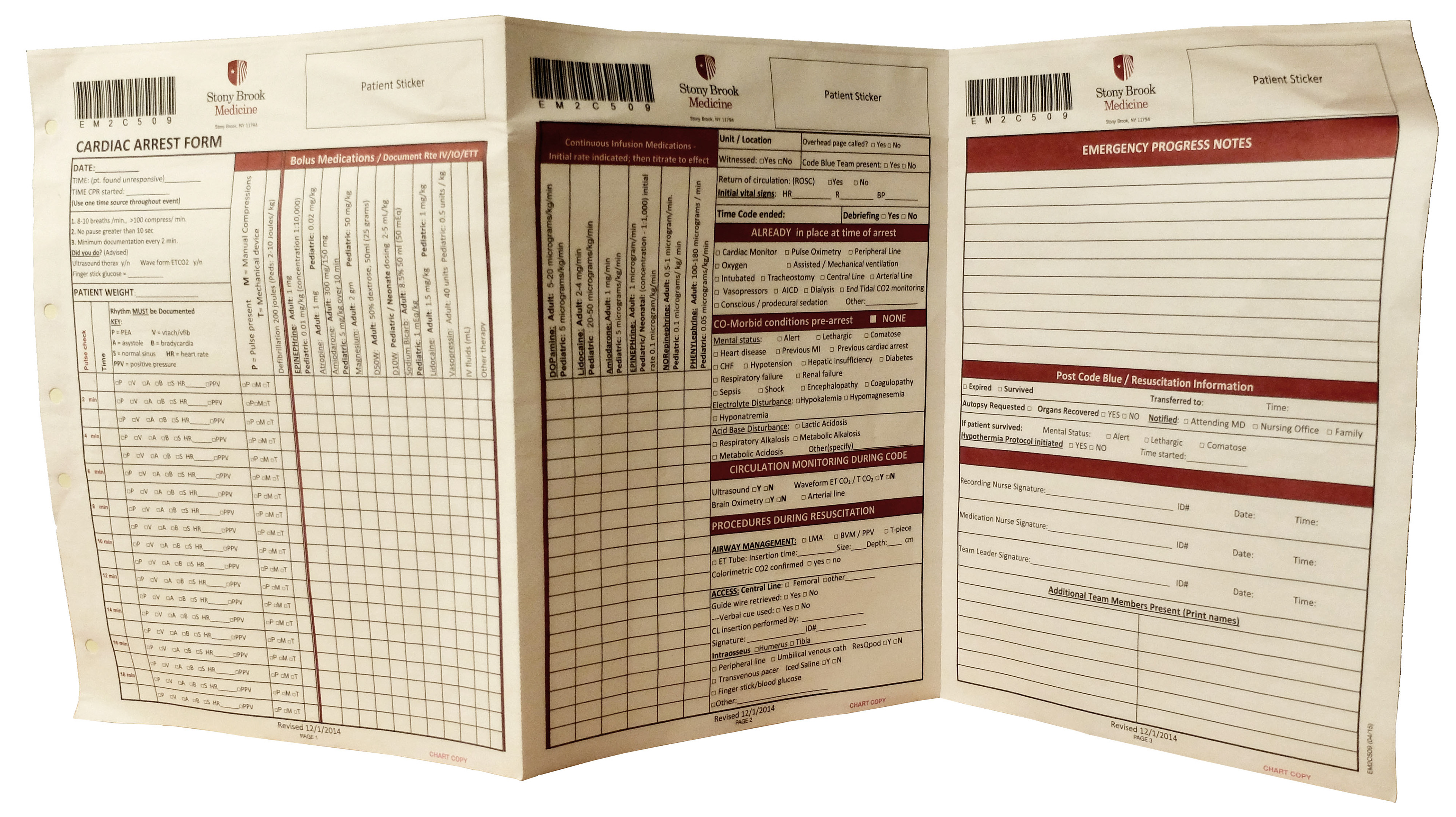
The three-page accordion form nurses use to record ACLS
My Role
I was the UX Lead in a team of doctors and programers. When I came on, the first user flow was a very literal interpretation of ACLS algorithms. It showed pop-up menu after pop-up menu. I wanted to create an experience that was more intuitive-- not invasive, to the user.
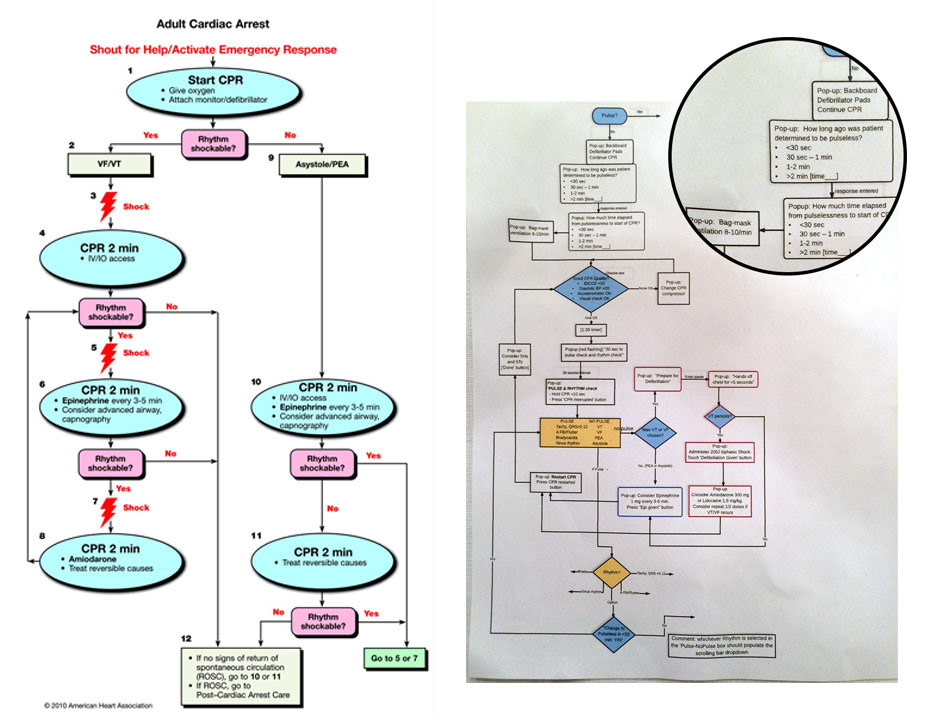
ACLS Algorithm VS original user flow, which is full of pop-ups
Research
I knew very little about ACLS before beginning this project, so I had a lot of work to do. ACLS is a more complex CPR that relies on a set of algorithms to guide a team through the process. As an outsider, I didn't know what steps did or did not need further explanation during a code. How much does a doctor rely on his experience? What does the app need to remind him to do? I studied passages and algorithms from the American Heart Association ACLS handbook. I met with doctors to help clarify the importance of each step. I watched YouTube videos of simulated codes designed to teach medical students. I also looked for ACLS apps that already exist to see how someone else solved this problem. The below apps have a lot going on visually, and they fail to address all the points Stony Brook hopes their app will achieve. The multiple timers are very distracting, so I used these as examples of what not to do.
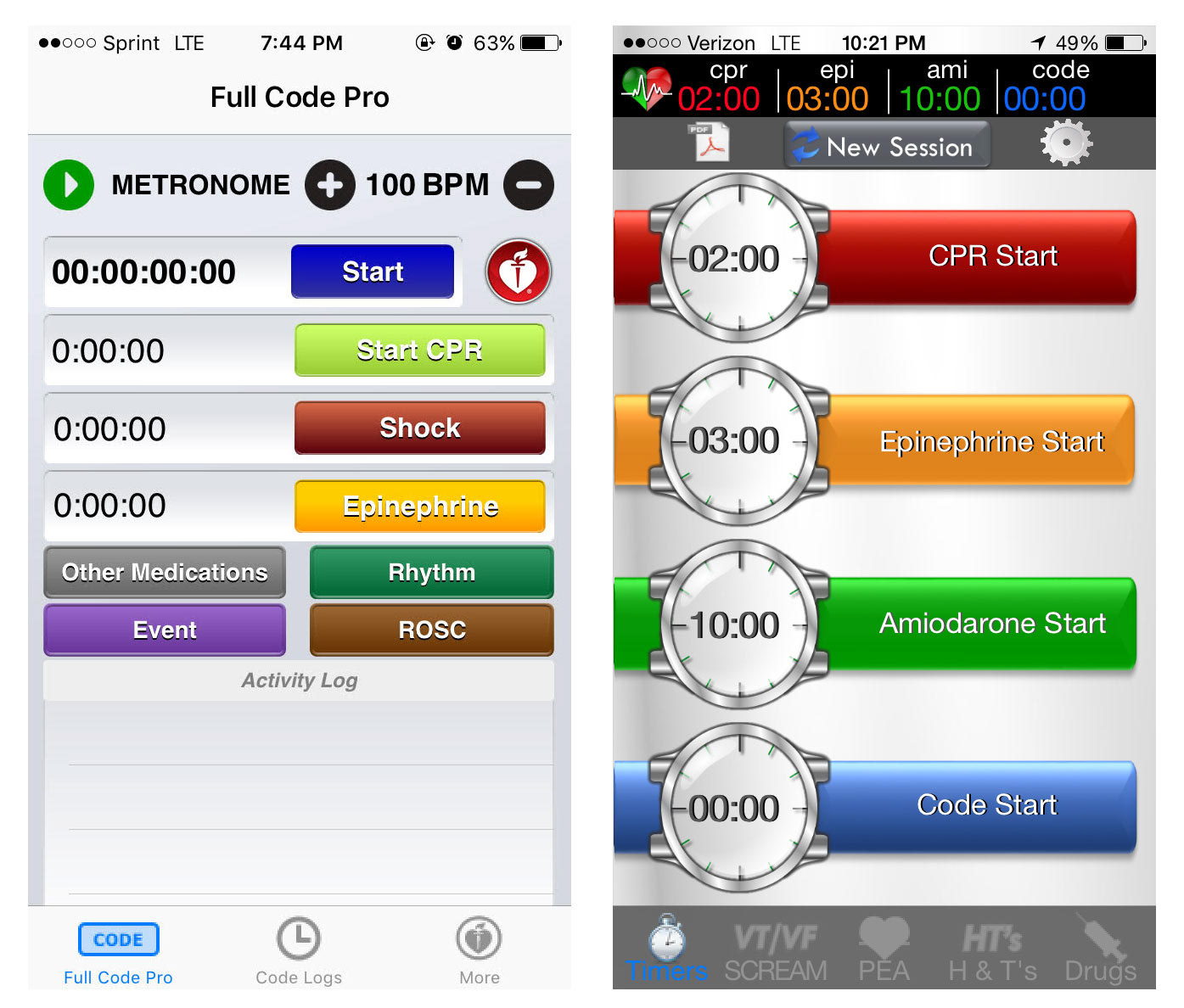
Code Blue apps currently available
Design
ACLS can be chaotic. A lot is going on and a lot of information needs to be communicated and recorded. For this app to be successful, we needed and action screen and a checklist that are both easily understood and accessible. I began sorting out my notes and coming up with initial user flows and sketches for our main screens. My first screen designs weren't much of a deviation from the above apps, but as I gained better understanding of ACLS I felt comfortable exploring different approaches.
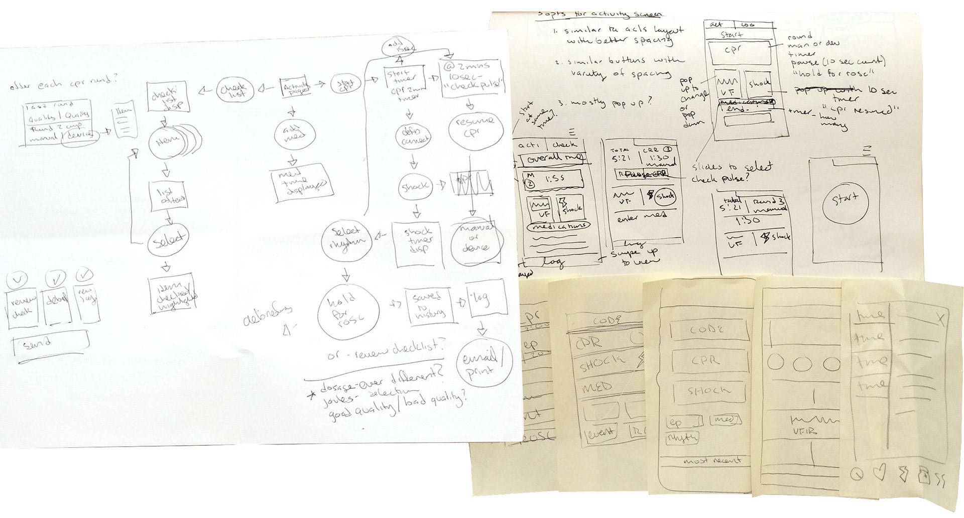
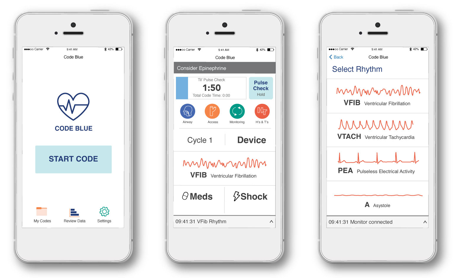
This app was intended for an iPhone 5 because all Stony Brook professionals had one on hand at the time. I designed a few layouts for the action screen and considered how a user would interact with the app during the code. I added a recommendation bar at the top and a log at the bottom. I wanted to stay as simple as possible. I eliminated unnecessary timers and instead used visuals to orientate the user.

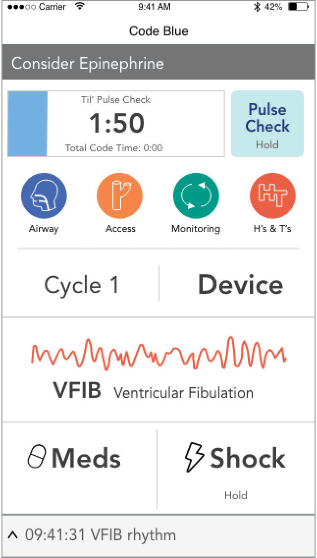
I continued to develop option three. The administrating doctor suggested adding a reminder to check CPR quality (e.g. are compressions given at the correct speed?), because this section was often forgotten on the form. I wanted to keep the action screen clear, so I added neat circular buttons under the timer. After initial user feedback, I created a Pulse Check button separate from the timer and removed the bottom menu.
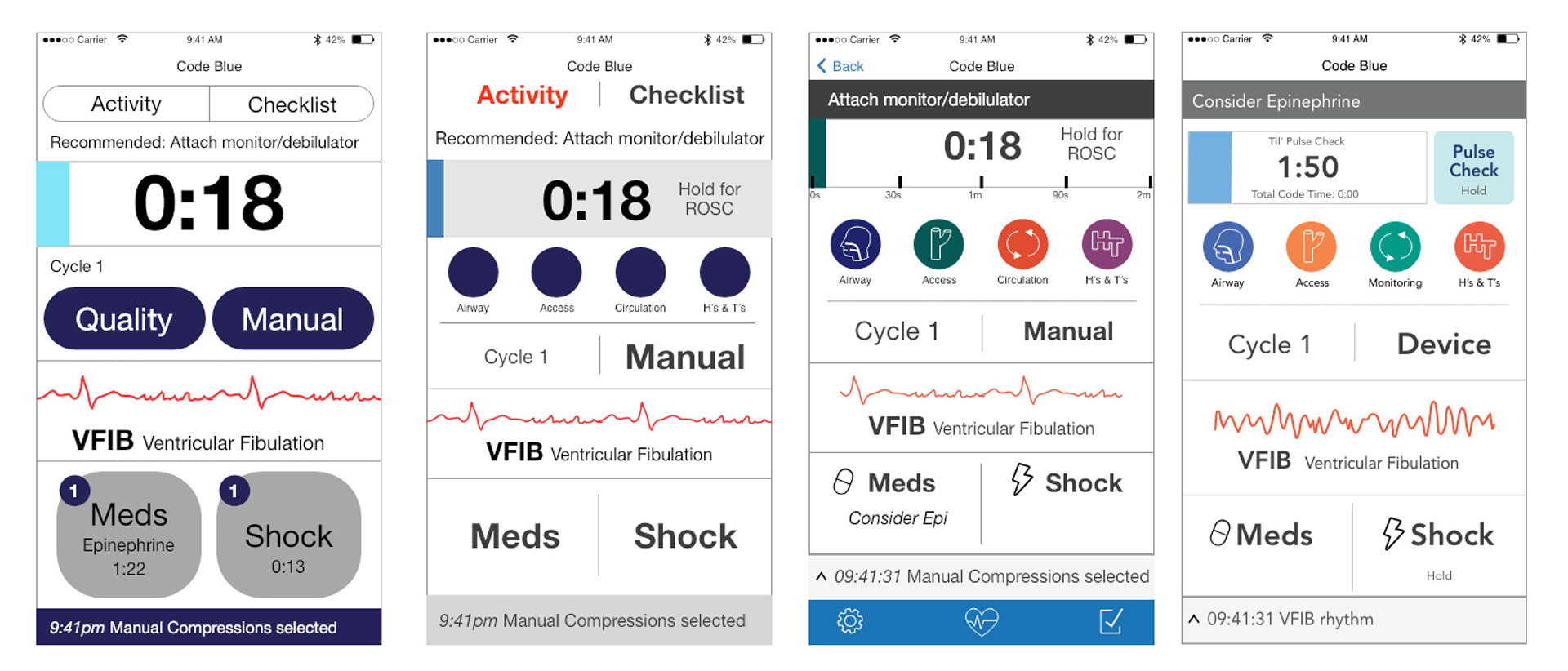
The final action screen is divided by common actions at the bottom and less common actions towards the top. During the code, the user focuses on recording medications, shocks, and observing the rhythm. However, to ensure he will remember to fill out the quality CPR measures and announce when to check the patient's pulse, the top portion contains more color and contrast, a gentle way to remind the user to look up.
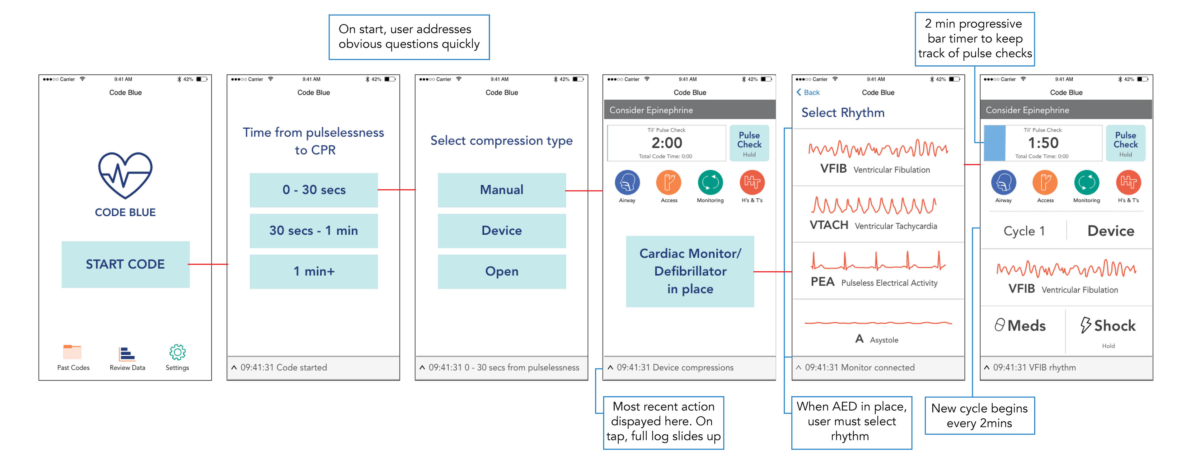
I used the main screen as a base and fleshed out a more detailed the user flow with wireframes.

Prototype
Below is the most recent prototype video, created with Adobe XD.
Unfortunately this app did not continue onto development due to lack of time and resources from the original team of doctors. Though it was tough for me to let go such a complex and time consuming project, I am proud of what we were able to accomplish. This project helped me see that better solutions are out there when we take the time, care and commitment to solve the problem.